

Anatomy of a Grid for Editorial Design
Last Updated on: 28th December 2023, 03:55 am
Editorial design is one of the branches of graphic design that deals with projects and publishing such as books, newspapers, portfolios, and magazines. Whether we are talking about a printed newspaper or a digital magazine, knowledge of the anatomy of a grid is required in editorial design.
Good editorial design is coherent, clear, and pleasant to read. Above all, the goal of publishing design is to make publications attractive and easy to read. For this purpose, graphic designers rely on the grid.
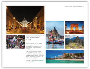
The use of grids plays a very important role in the way information is designed, presented, and understood in an editorial publication. For instance, newspaper article design, magazine layout ideas, and book illustrations require special attention to the location, size, and combination of the information elements that make up the design.
Understanding the anatomy of the grid in editorial design makes it easier to know how and where to place information within a composition.
[cite]
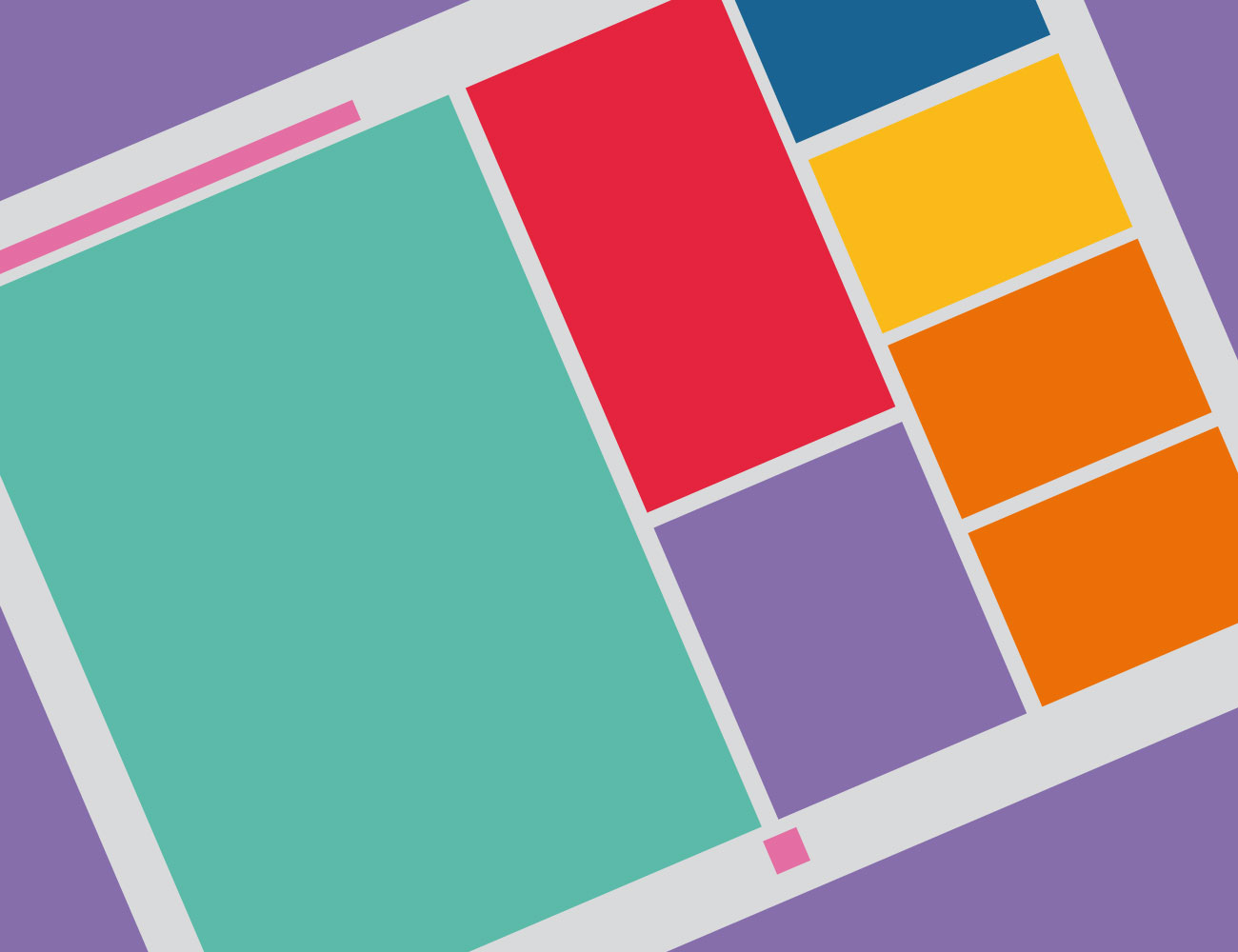
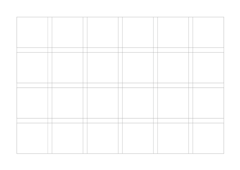
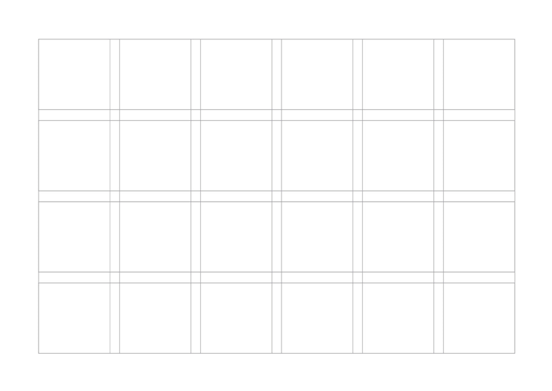
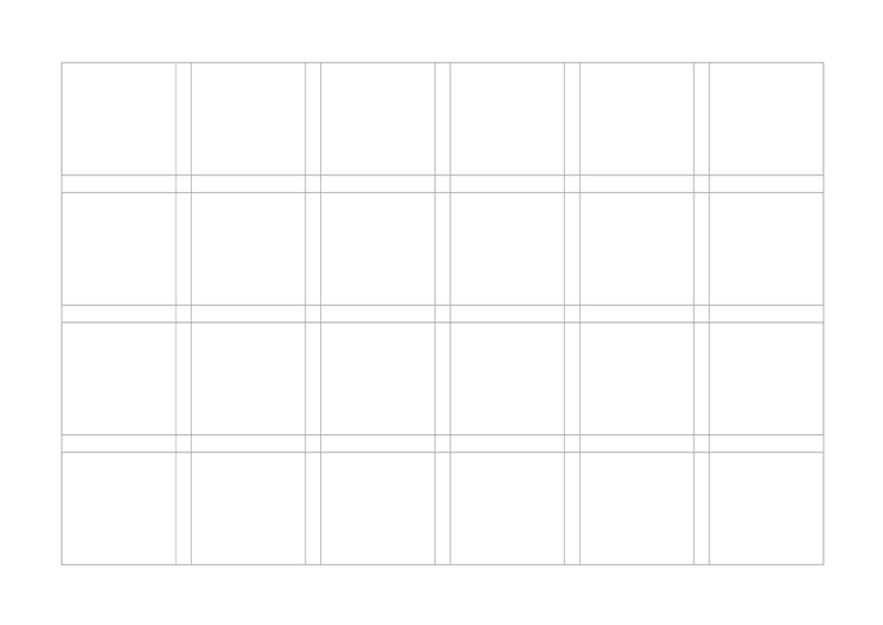
Grid Anatomy
What are the parts of a Grid?
Once the importance of using a grid has been established, the following points below describe the components of a grid:
Format
The format is the complete area where the final design will be presented. For example, in the print design, the format can be a letter-sized page or a poster-sized page. On the other hand, in web design, the format is the browser window of a desktop computer or mobile device.
Margins
Margins are the empty spaces between the edges of the format and the content. Consequently, the size of the margins is what gives the content a general shape, usually a rectangle.
First of all, set the margins. Establishing the size of the margins is the first step in building a grid. This will indicate the space available for work. However, this should not be confused with padding, which is the space within rows and columns.
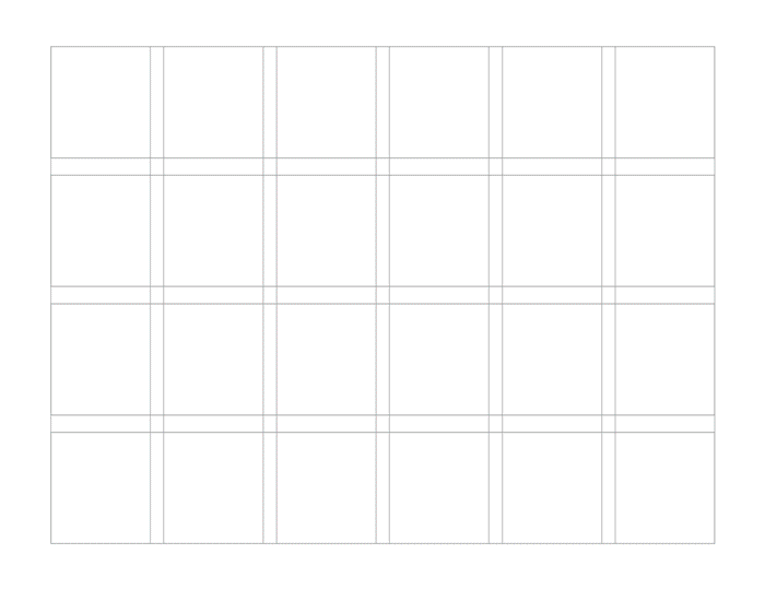
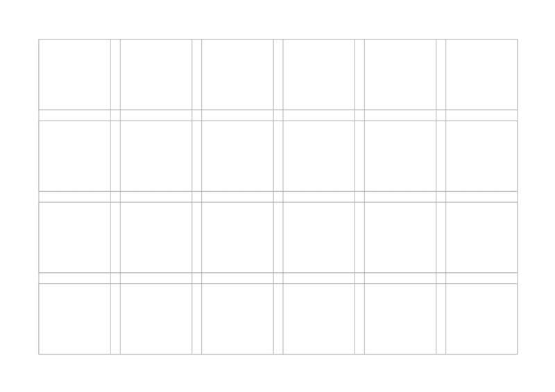
Columns
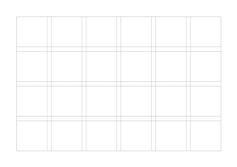
Columns are the vertical sections of a grid. A grid can have 1 column as well as 16 columns. The number of columns depends on the type of publication. In other words, more columns in the grid mean more flexibility.
Columns gain great relevance in the design of websites and in editorial publications such as newspapers and magazines.
Rows
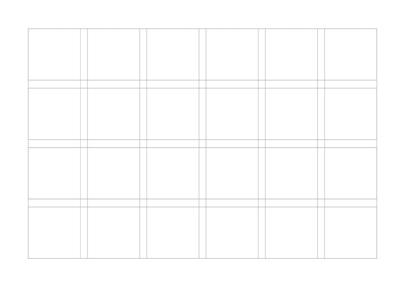
Rows are the horizontal sections of a grid. They help to separate the content horizontally.
Modules
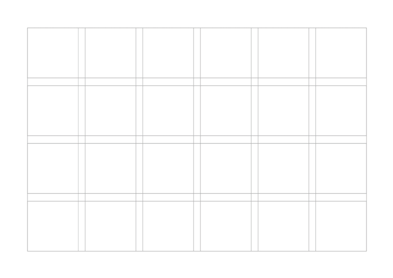
Modules are the building blocks of any grid. They are the spaces created by the intersection of flow lines and vertical lines. Vertical groups of modules together create columns. Horizontal groups create rows.
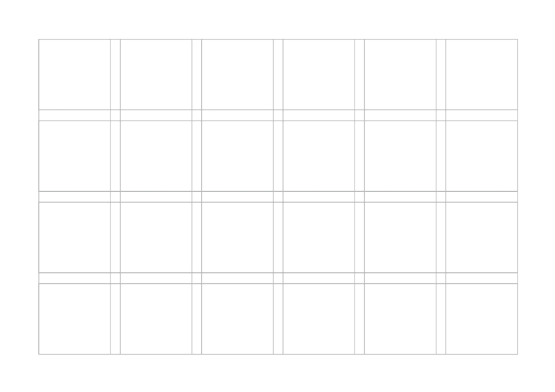
Gutters
Columns and rows are divided by gutters. Imagine a city, the gutters would be the streets and avenues.
When the gutter is narrower, more visual tension is created. On the other hand, grids with wider gutters produce soothing templates because the elements of the composition have less tension between them.
Spatial Zones
Spatial zones are groupings of columns, rows, or modules that form a composition element.
Groups of adjacent modules in vertical and horizontal areas create spatial zones or regions. For instance, a vertical region may contain a text spot, and a horizontal region may contain a photograph. Regions can be arranged proportionally or used to create overlapping zones.
Flow Lines
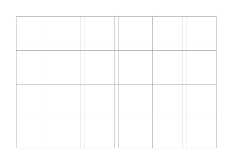
Flow lines are horizontal lines that separate the different sections of a grid into parallel bands. They help the reader follow the content of the design.
Flow lines also create stop points or edges for the elements to be placed. Some flow lines are called hanging lines, and others are called baselines.
Markers
A marker is an area in which one places secondary content. They mark the exact place where the information to be repeated from one page to another is placed.
Books and magazines commonly use them for chapter titles, page numbering, headers, footers, etc.
Some Insights
There are several considerations that must be considered before applying grids to a project. Once the importance of grids in graphic design has been understood, as a next step, I recommend identifying several types of grids for editorial design.
Share
Spread the love… and this post!
If you liked it, share this post on your social networks, such as Facebook, LinkedIn, or Twitter. Smart designers share good things with others.
Bibliography
- Dabner, D., Stewart, S., Vickress, A. (2020). Graphic Design School: The Principles and Practice of Graphic Design (7th ed.). Wiley.
- Leborg, C. (2006). Visual Grammar: A Design Handbook (Visual Design Book for Designers, Book on Visual Communication). Princeton Architectural Press.
- Malamed, C. (2009). Visual Language for Designers: Principles for Creating Graphics That People Understand. Rockport Publishers.
- Müller-Brockmann, J. (1996). Grid Systems in Graphic Design: A Visual Communication Manual for Graphic Designers, Typographers and Three Dimensional Designers. Niggli AG Verlag.
- Poulin, R. (2018). The Language of Graphic Design Revised and Updated: An illustrated handbook for understanding fundamental design principles. Rockport Publishers.